UX & Design consulting for Fortune Global 100 clients and innovative startups


My role:
 UX & Design consultant
Platform: Web, Mobile, HMI
Industries: Automotive, Aerospace, Fitness, Real Estate, Crypto, Healthcare, E-commerce
Period: Jun 2022-Present
Contract: Part-time contracts, Project-based contracts

Since June 2022, I’ve been providing strategic UX & Design consultancy services, engaging with Fortune Global 100 companies and innovative startups across a wide range of industries.

The strategic nature of my work with these clients necessitates confidentiality, limiting the specifics I can share. However, I can outline the general areas of my consultancy: conducting UX audits, leading research and design strategies, and facilitating transformative changes across platforms such as web, mobile, and HMI, to align with business goals.

A significant aspect of my consultancy is the facilitation of high-stakes business discussions, which are instrumental in aligning design strategies with business and branding goals. These discussions ensure that design initiatives not only elevate user experiences but also contribute to the commercial viability of projects.

Working alongside board members, design directors, and lead designers, I help them unlock the full potential of their design capabilities, driving innovation and achieving notable business outcomes.

ŠKODA AUTO UX & Digital Design organisation


My role:
 Lead, and later Head of UX & Digital Design
Platform: Web, Mobile, In-car HMI
Industry: Automotive
Period: Sep 2018-Nov 2021
Contract: Full-time employment

ŠKODA AUTO started a digital transformation several years ago and it was further accelerated by the Strategy 2025, and the newest Next Level ŠKODA Strategy 2030.

I was hired in 2018 to help establish a modern UX practice and turn the strategic goals into reality. First, I analysed the as-is state and then I gradually started testing and implementing new ways of working within the HMI (in-car) department. Later, I joined the umbrella UX team which within a year, I had the privilege to become the Head of.

Overall, my role was pivotal in increasing the organisational UX maturity, breaking internal silos, connecting disjointed teams, adopting agile and user-centred practices and mindsets, and getting the necessary finances and approvals. I also worked intensively with my team to create an efficient and collaborative UX & Design culture. Furthermore, I mentored, coached and helped find career direction for multiple people on my team.

Within the complex environment of a multi-national and multi-brand Volkswagen Group, I was responsible for the overarching ŠKODA AUTO’s UX & Digital Design strategy, leadership and management. Our successes were recognised beyond ŠKODA and I was a key contributor and consultant to many VW Group-wide UX initiatives.

Building and shaping SKODA’s User Experience together with Matej was a big pleasure for me. His professionalism and engagement is evidence of his highly developed goal-orientated working style. Matej always exhibits an exceptionally high dedication to his work and convinces stakeholders with his extensive knowledge.

Neele WieczorekHead of Holistic UX, ŠKODA AUTO (as of 2020), LinkedIn recommendation (2020)

ŠKODA AUTO Flow digital design system


My role:
Project UX&UI director on the ŠKODA AUTO’s side
Platform: Web, Mobile, In-car HMI
Industry: Automotive
Period: Nov 2019-Nov 2021
Contract: Full-time employment

ŠKODA AUTO’s digital offering needed a strong and systematic design foundation that would connect disjointed products as well as teams.

I selected and hired the core Flow team, created the right environment and got stakeholder buy-in as well as the budget to consolidate ŠKODA AUTO’s digital landscape. This was a mammoth task since dozens of stakeholders from multiple departments and business units with varying goals and expectations had to be included. I also reviewed and directed the creation of the system itself.

The Flow design system now provides designers and engineers with digital product principles and guidelines. It spans multiple platforms and its library comprises more than 1,000 different styles and components. It has sped up the workflow for designers and engineers when developing or redesigning a digital product and brought significant business benefits. Furthermore, our approach became a blueprint for the entire VW Group.

Flow was awarded the Red Dot Award 2021 in the Brands & Communication Design category.

ŠKODA AUTO MyŠKODA mobile app vision


My role:
Project UX&UI director on the ŠKODA AUTO’s side
Platform: Mobile
Industry: Automotive
Period: Nov 2020-Nov 2021
Contract: Full-time employment

eMobility is the key strategic topic for the whole automotive industry. We asked ourselves, how might we support the usage of an electric vehicle so that users feel empowered, supported and in control?

Together with my predecessor, we got the buy-in from the key stakeholders to create a new vision of a vehicle-accompanying mobile app.

I reshuffled internal teams and hired extra team members with the right skills. I gave the team the freedom to experiment and required them to validate with prospect users frequently. I provided feedback, direction, and guidance in both user research and design activities.

The result – the MyŠKODA app vision – is a smartphone app that connects people and vehicles to the ŠKODA AUTO digital ecosystem. Delivered with intuitive UI and written in clear language, users can, for example, remotely control mechanical aspects of the vehicle, view diagnostic data, and offer vehicle sharing via multiple accounts.

The MyŠKODA app vision was awarded the Red Dot Award 2021 Best of the Best in the Design Concept category.

BBC iPlayer high-performance team


My role:
UX & Design Lead
Platform: Web
Industry: News, Education, Entertainment, Public sector
Period: Sep 2017-Aug 2018
Contract: Full-time employment

BBC iPlayer needed to transform as a product to be able to deliver on its mission “to develop the best place to discover and watch BBC TV for the benefit of UK licence fee payers.”

I joined a fast-paced product team working on the browsing and discovery iPlayer experience on the web. The team already worked very well. At the same time, there was room for improvement in the ways of working and collaborating with the rest of the product team. I started integrating UX & Design into all team routines and practices which brought the team closer together and further sped up the team’s velocity and decreased the number of misunderstandings and rework. 

The product owner and I were also keen to improve our discovery process and make the team more hypothesis- and insight-driven. Together with our delivery and engineering leads, we established new pipelines for A/B and multivariate testing and dramatically increased the number of experiments the team was conducting. We also established continuous qualitative research. These steps led to significant improvements in our KPIs. The team was also widely regarded as one of the high-performance teams within the organisation.

He was crucial in transforming the product team into a high performing unit, ensuring product discovery was thorough & data driven whilst enabling the team to quickly learn and iterate. Matej was a great team member and always pushed the rest of the team to strive for the best. He has a personable and caring approach which meant it was always fun working with him and ensured moral in the team remained high.

Sam OwenProduct manager, BBC (as of 2018) LinkedIn recommendation (2018)

BBC iPlayer AWS migration and optimisation


My role:
UX & Design Lead
Platform: Web
Industry: News, Education, Entertainment, Public sector
Period: Sep 2017-Aug 2018
Contract: Full-time employment

BBC iPlayer had aggressive targets to migrate the iPlayer website from a proprietary solution onto AWS (Amazon Web Services) on time to ensure stability, scalability and maintainability of the service.

I was a part of a fast-paced product team working on the browsing and discovery iPlayer experience on the web. The migration presented an opportunity to improve the user experience and branding of the service. Moreover, this was also a great project for our trainee and junior level designers to experiment and learn–I spent a lot of time mentoring them to make sure they were progressing and stayed motivated which I enjoyed very much.

Together with the team, we redesigned multiple templates and categories and found solutions which were easier to develop and maintain while improving the user experience and brand perception. The whole process was insight-driven and we were frequently reviewing many data and feedback streams to ensure the new versions of the service performed better than the legacy ones.

We delivered on time and at the same time, we improved the product and the team culture.

Both a great senior and mentor to me, working under Matej in iPlayer really was a privilege. As I came into iPlayer relatively inexperienced, Matej went far beyond the remit of what was required to ensure I was both developing well and always enjoying the work I was doing.

James RobinsonJr UX Designer, BBC (as of 2018), LinkedIn recommendation (2018)

Intel Labs & UCL: An award-winning public installation


My role:
Lead researcher and designer
Platform: Hybrid physical-digital device
Industry: Internet of Things, Education, Environment protection
Period: Jun 2017-Sep 2017
Contract: HCI MSc project

How might we get the public interested in a niche environmental topic so that they reflect on their attitude and knowledge?

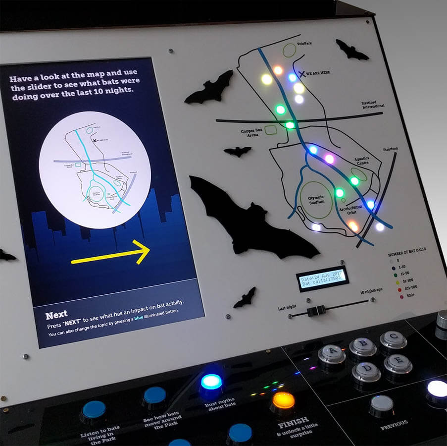
Intel Labs and University College London (UCL) were working together on a project to monitor urban bats in the Queen Elizabeth Olympic Park in London. Through Intel’s work, a novel IoT (Internet of Things) data stream of urban bat activity became available to researchers.

While interest in the data from an academic community was significant, we asked a question about whether this new data could be used to engage the public by sharing new insights not available before. In this project, I explored the use of tangible interfaces.

I designed and built a novel multi-modal physical device to visualise the dataset of bat activity. An in-the-wild evaluation showed great promise in that such a physical device can be successful in engaging the public even on a topic in which people may not already have an interest.

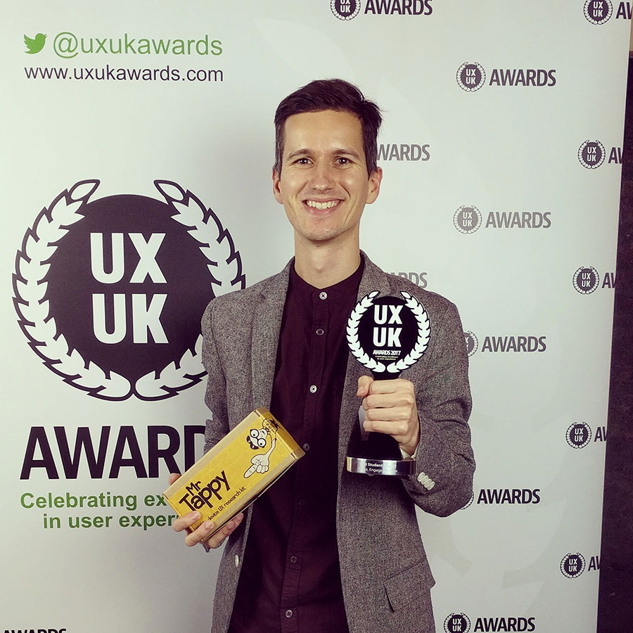
The project has been very successful:

Matej has a very bright future, with the enviable ability to straddle both industry and academia.

Yvonne RogersDirector, UCL Interaction Centre, LinkedIn recommendation (2018)

Which? CELL design system


My role:
Project Lead, UX Designer
Platform: Web, mobile
Industry: Publishing, Non-profit
Period: Sep 2015-Sep 2016
Contract: Full-time employment

Not having a single design point of reference made it hard for Which?, the UK consumer association, to keep their products concise. It also hampered design and development speed, as well as overarching scalability and maintainability.

I initiated the creation of a multi-disciplinary team of UX designers, UI designers and front-end developers. At first, I co-led with one colleague but later was assigned the sole responsibility for leading the project. I excited others for the project and got the buy-in and support from the management to bring the design system alive. I established collaborative ways of working to develop the system and was one of the key contributors myself.

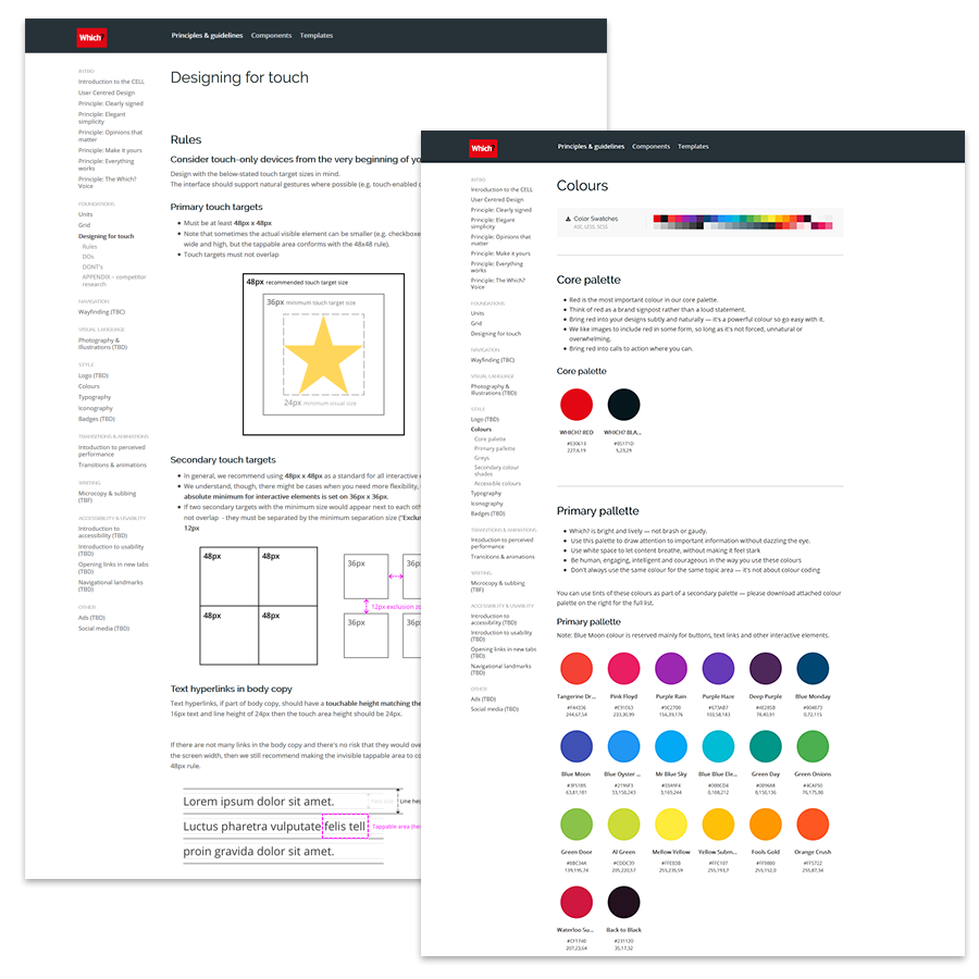
We delivered CELL – Component & Experience Language Library, which facilitated more cooperation between design and engineering, created one source of truth, saved design and development time, and made Which?’s products and services more coherent and easier to use.

Matej strikes a fantastic balance between being incredibly knowledgeable and thorough, whilst retaining a sense of openness and inclusivity in his design approach.

Angela ArnoldPrincipal UX, Which? (as of 2016), LinkedIn Recommendation (2016)

Which? Money – the foundation for a new proposition in the financial space


My role:
Project UX Lead
Platform: Web
Industry: Publishing, Non-profit, Consumer advice, Finance
Period: Feb 2016-Jul 2016
Contract: Full-time employment

Which? Money is part of the independent consumer organisation and gets over 10M visits every year. However, obsolete design and suboptimal user experience hampered Which? Money website performance.

I involved editors, senior stakeholders, designers and developers and I guided the project to rigorously follow the user-centred design process. I started off with an in-dept desk, trend and competitive research, which helped us to set the vision and the initial outlines of the revamped service. I continued with information architecture and information design. Every step of the journey was validated with the end-users. Later, we worked closely with a visual design lead to find a new visual language for Which? Money.

Resolving key pain points and redesigning the service in a user-centred way resulted in a very positive response from customers, we also saw a significant decrease in the top task completion times and a significant increase in direct path success. Together with engineering, we created easier to implement and maintain templates which would allow for further evolution of the service.

Matej has been instrumental in the re-design of the Which? Money proposition and again his grasp of complex content, intricate IA and limitations of the content systems and underlying technical structure was crucial to the successful completion of the initial migration – which has in turn built a solid foundation for the subsequent iterations and the development of new propositions in the financial space.

Rick LippiettHead of Design & UX, Which? (as of 2016), LinkedIn recommendation (2016)

Let’s work together

Whether you already have something specific in mind or you need help framing your challenge, I’m looking forward to hearing from you.

I'm based in Prague, CZ, Europe. Available for remote work globally.