Which? Money
The evolution of expert advice: Adapting Which? wisdom for the digital age.
Which?, consumer association
Period
02/2016-07/2016
Industry
Consumer advice
Finance
Platforms
Responsive web
My role
UX lead
Obsolete design and suboptimal user experience hampered Which? Money website performance. I involved editors, senior stakeholders, designers and developers in a user-centred design process in which several rounds of research and multiple design iterations resulted in a easier to maintain system and improved user experience.
Background
Which? is the largest consumer body in the UK with a growing base of approximately 1 million subscribers to their online and offline services. Since its start at 1957, Which? magazines have been known for independent product and service reviews but the organisation is currently active in many consumer right related areas – from campaigning for consumer rights to providing independent money guidance to selecting a university, birth choice or elderly care provider.
As most traditionally publishing companies, Which? is currently undertaking a digital transformation.
Which? Money offers a multi-channel experience comprising of a print magazine, phone helpline, and multiple websites.

Challenge
Which? Money provides guidance on money matters, competing with websites such as moneysavingexpert.com, moneysupermarket.com, moneyadviceservice.org.uk and others.
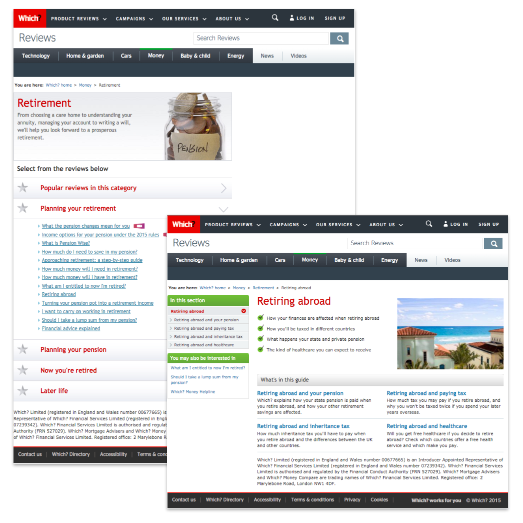
In the initial user research, we discovered that the original navigation structure, as well as the page template design, did not make it easy for users to move around the site, thus hampering the overall usefulness and trustworthiness of the service. The site was also not mobile optimised.
Since the Money site was due to be migrated to a new CMS platform, an opportunity arose for the major issues to be fixed and user experience improved.
My role
I worked as a lead UX designer on the project, being supervised and mentored by a UX principal. I prepared user testing studies together with a fellow user researcher, worked closely with a UI designer, developers and SEO managers.
My role involved a lot of stakeholder management – including a product management team, the Money publishing team, and the company senior management.
Goal
Redesign the Which? Money advice vertical to make it easier to navigate and consume, as well as to maintain from a technology perspective. Bring it up to modern web design standards to represent Which?'s transition into the digital age effectively.
Target audience
The Money site comprises of ten sections. Each of them (Mortgages, Insurance, Tax,…) has a specific target audience which was identified through interviews with internal subject-matter experts.
In general, the website seeks people who are interested in financial news and look for guidance on money related matters.
Process, methods and tools
Working in a scrum development, a sprint zero and dual-track agile was used to get ahead of development and to then collaborate effectively.
Discovering
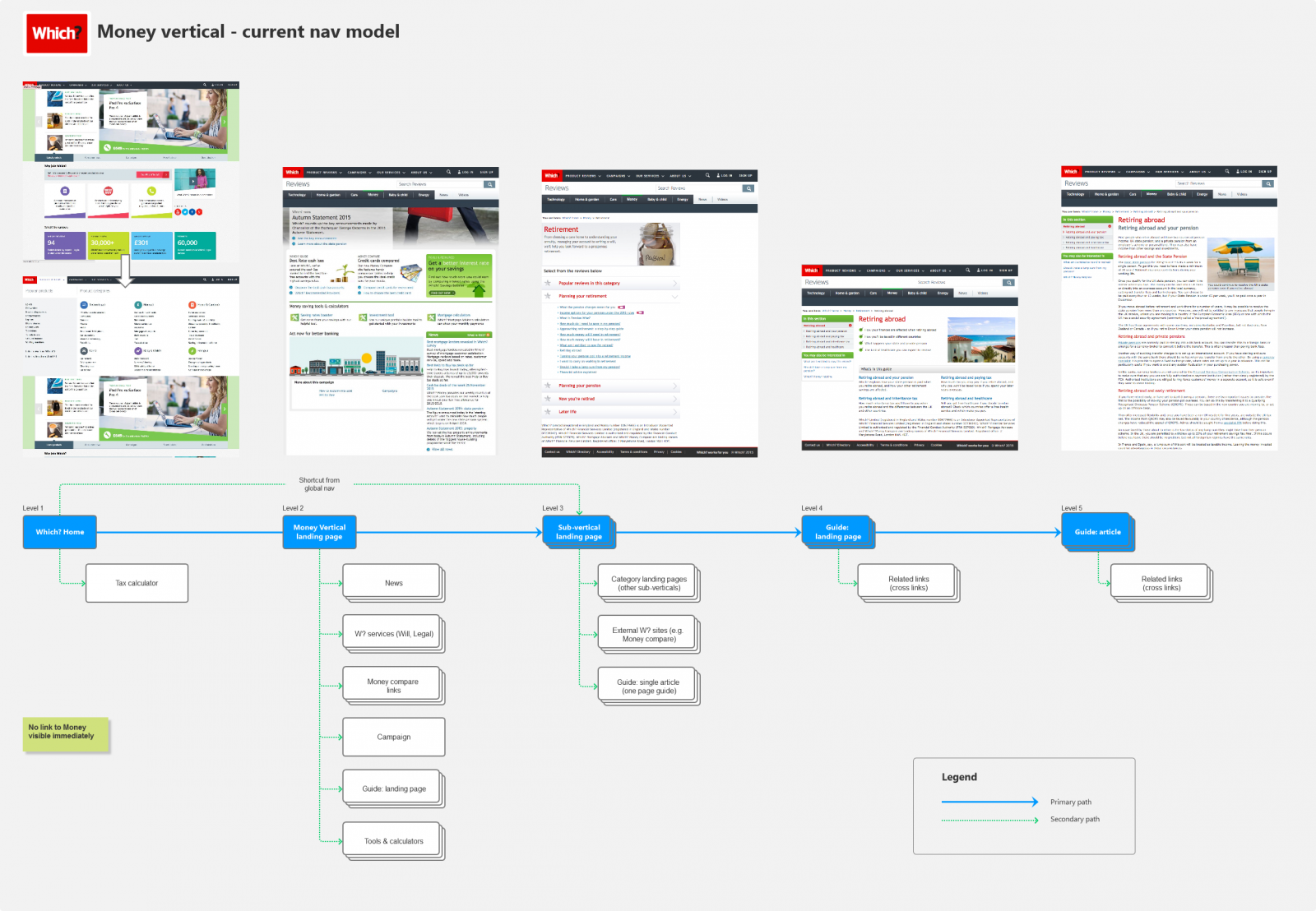
Mapping navigational models of Which? Money and competitors
I created hierarchy models of 7 competitor websites and Which? to see commonalities and differences. I also mapped the taxonomy of Which? Money site to understand the sheer amount of information being online at that time.

Competition usability testing
We presented users with several competitor sites alongside Which? Money and gave them various tasks to understand how they perceived different forms of information representation and navigational structures.
Site stats and search logs
I went through Google Analytics stats, ClickTale, Google search terms and the internal search log to understand how users currently move along the website and what they search for.
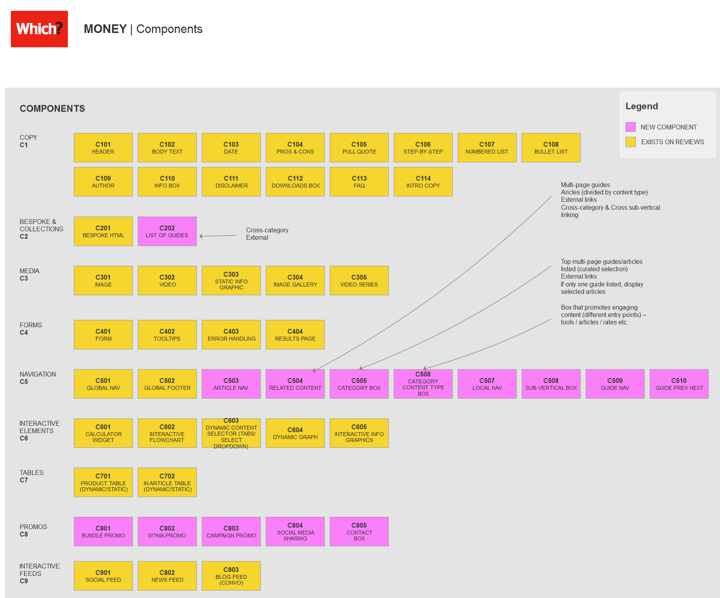
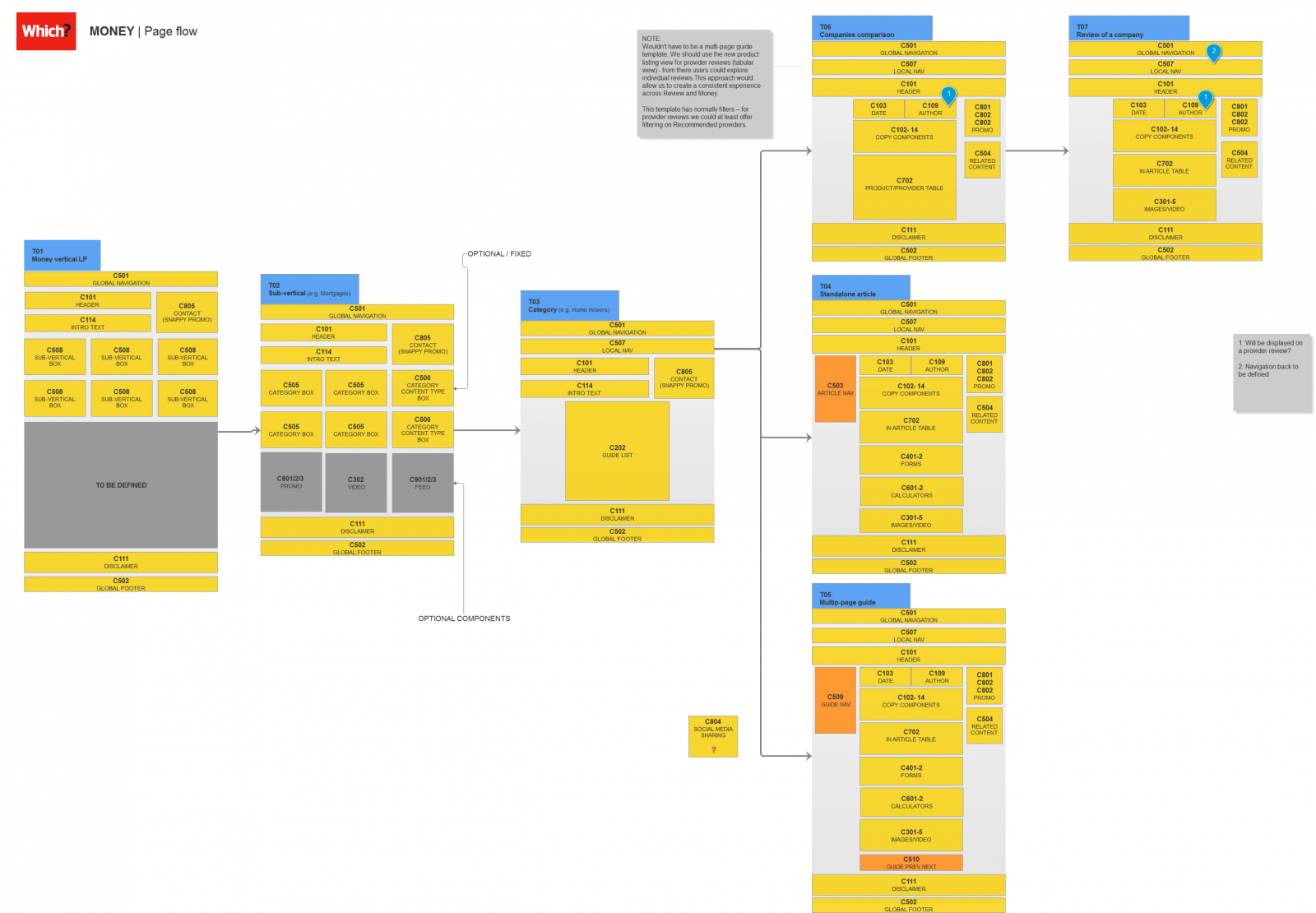
Page anatomy mapping & Component audit
I and the UX Principal mapped components of all page templates to understand the logic behind the current solution and to uncover inefficiencies.

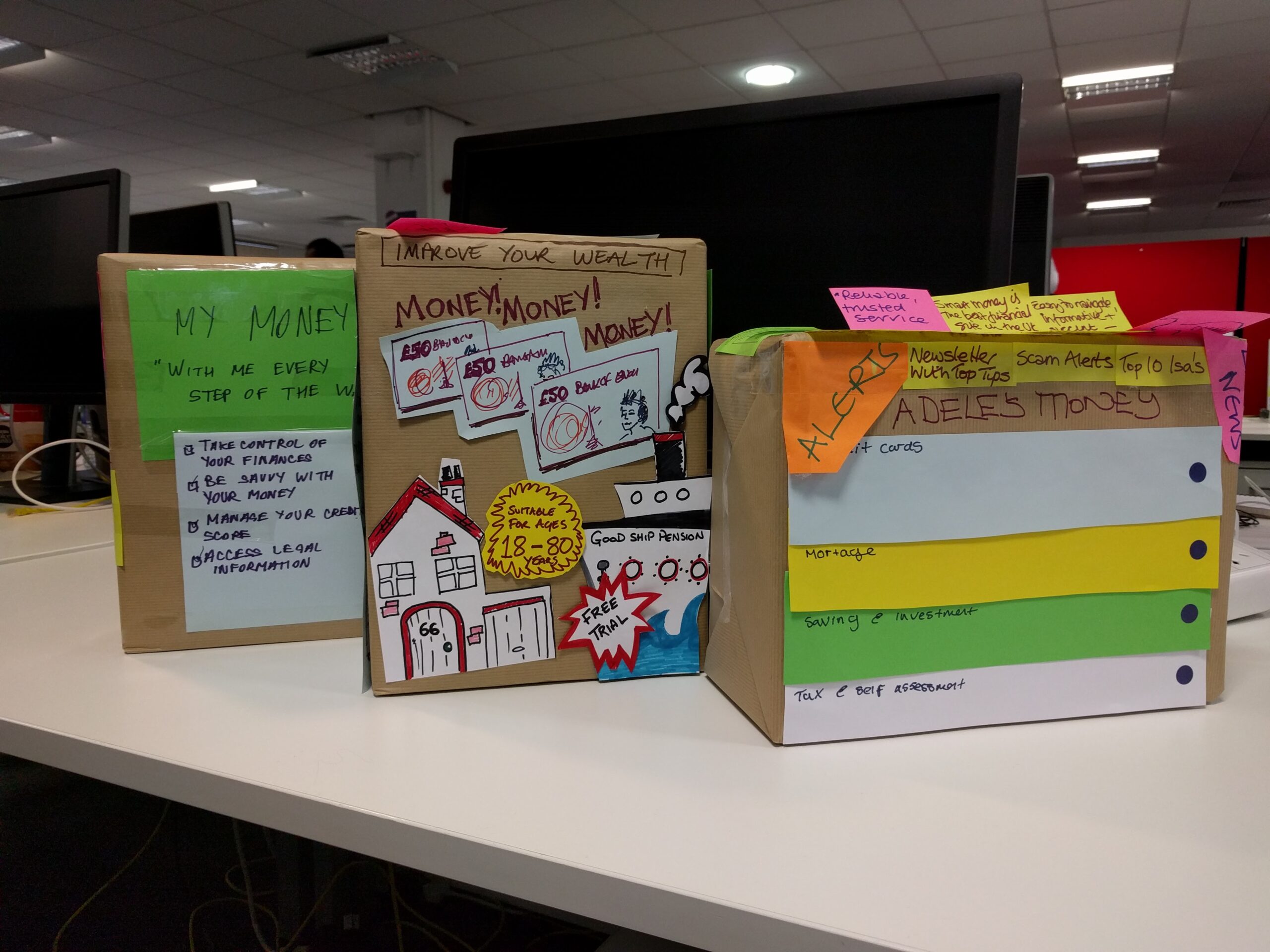
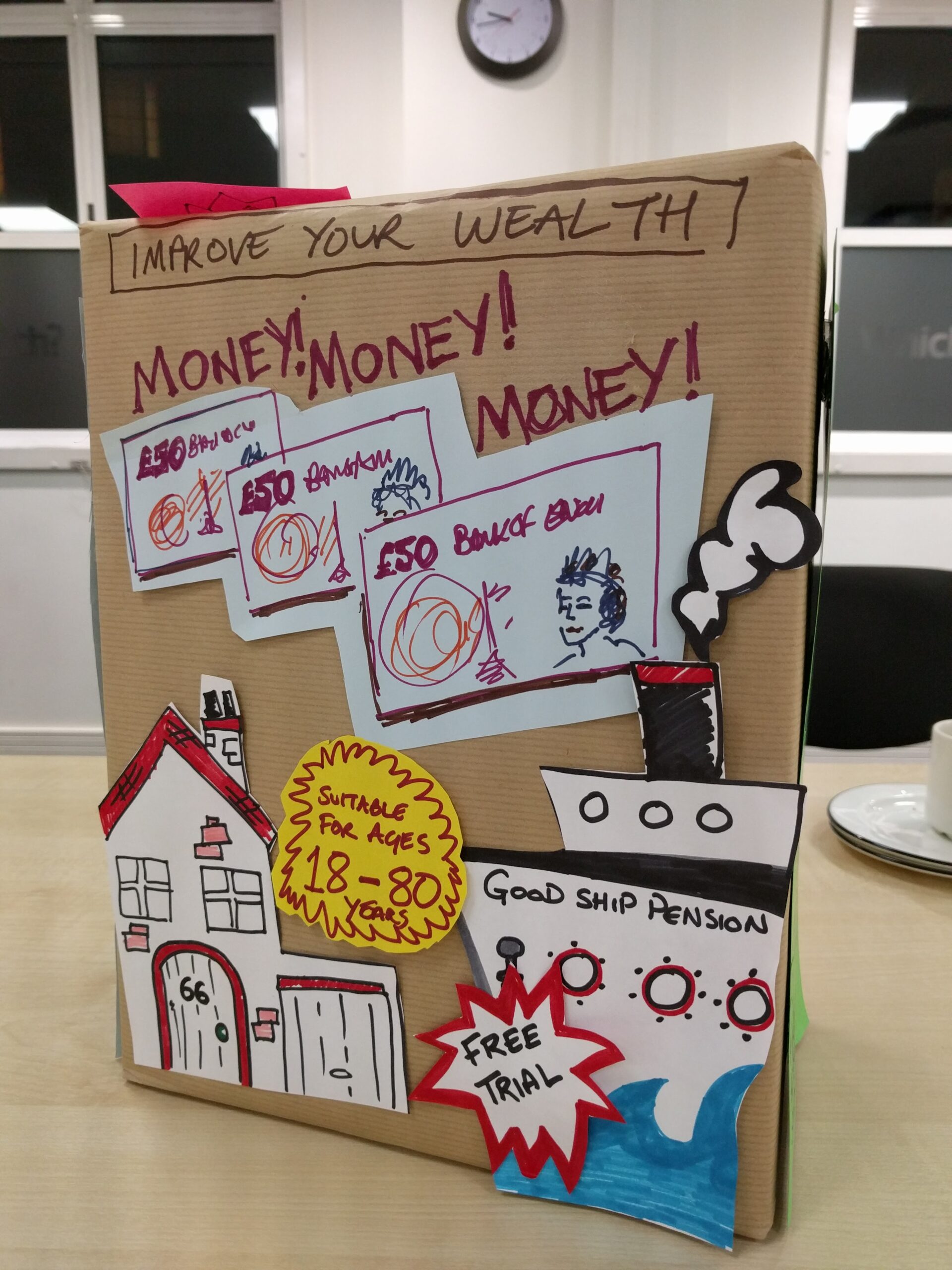
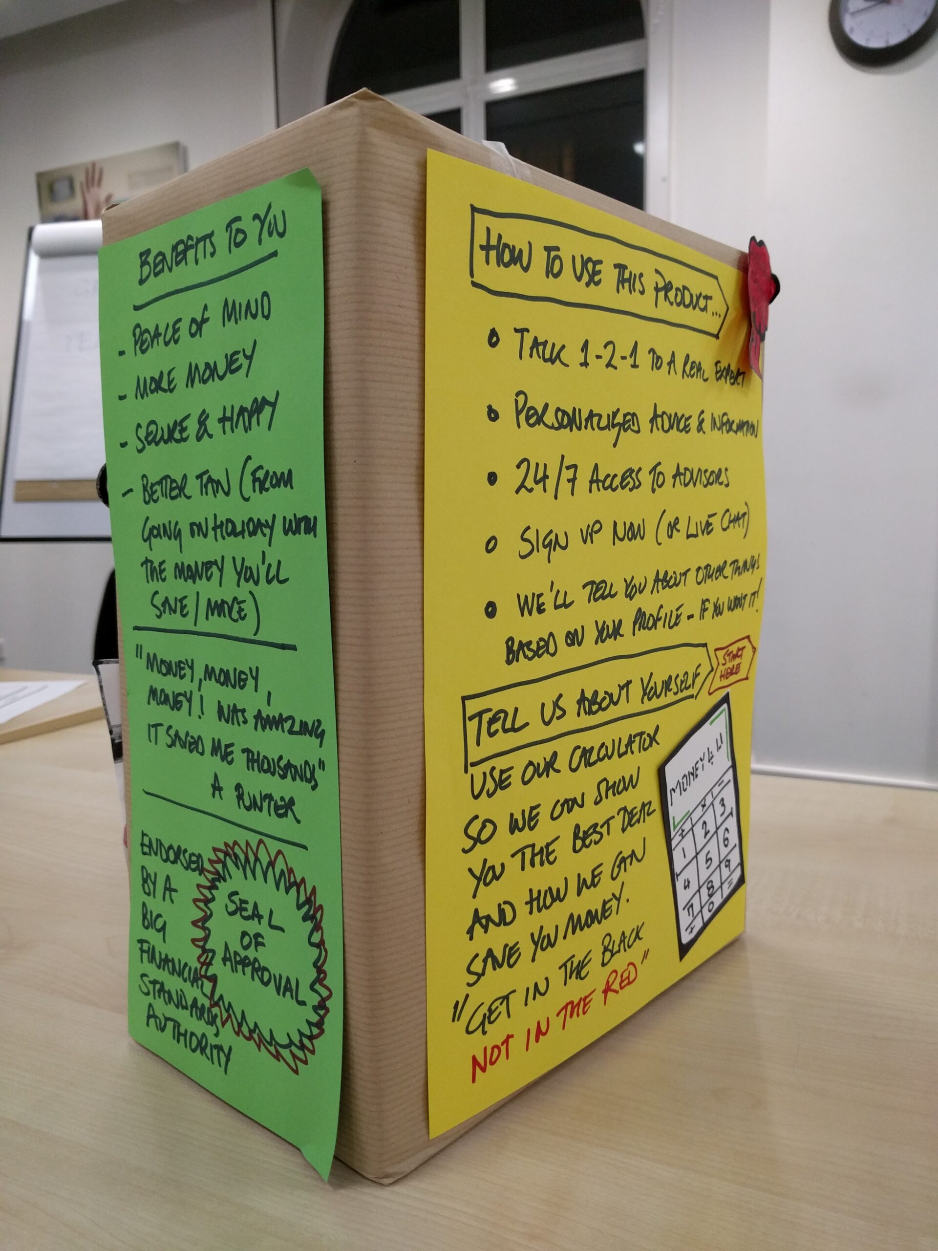
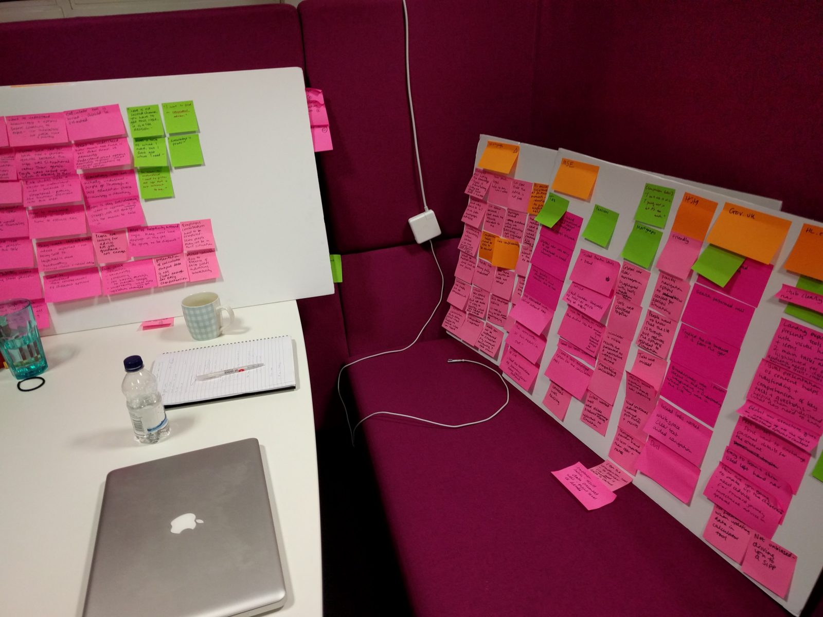
Design the box workshop
I co-facilitated a workshop aimed at understanding what was truly important to the target audience. They needed to reflect on the ‘Which? Money’ vision and package it as a physical product to sell.


Requirements gathering & Stakeholder interviews and workshops
I was present at a number of senior management meetings on behalf of UX to advocate the need for change and to understand the business drivers behind the project.
I also ran several workshops with stakeholders to gather and prioritise their requirements.
Defining & Structuring
New user journeys
I designed a new simplified user journey removing extra steps for the users.

New information architecture
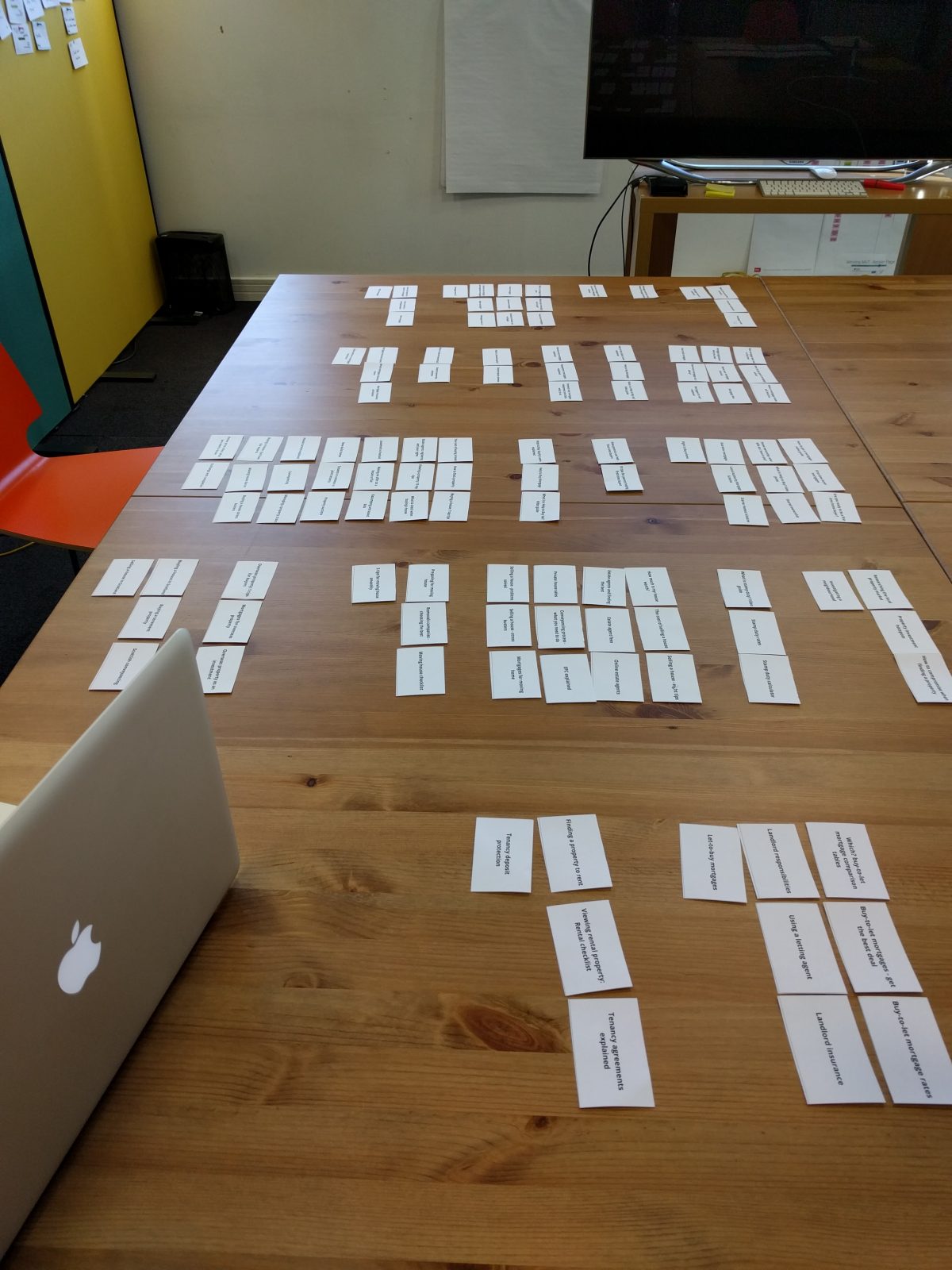
I developed a new site taxonomy and within- and cross-category linking mechanisms.
I recruited participants from within the company and run a series of card-sorting sessions with them, together with a fellow user researcher. Then we used a new taxonomy and iteratively tested and improved it using Optimal Workshop Treejack in a remote setting.

Prototyping
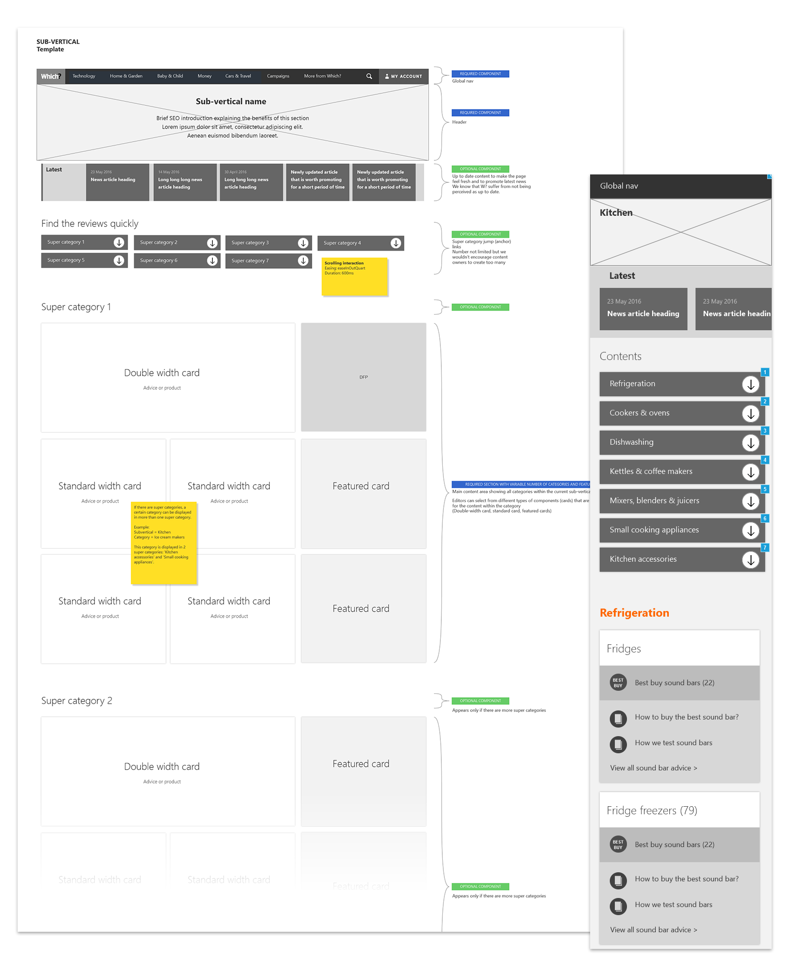
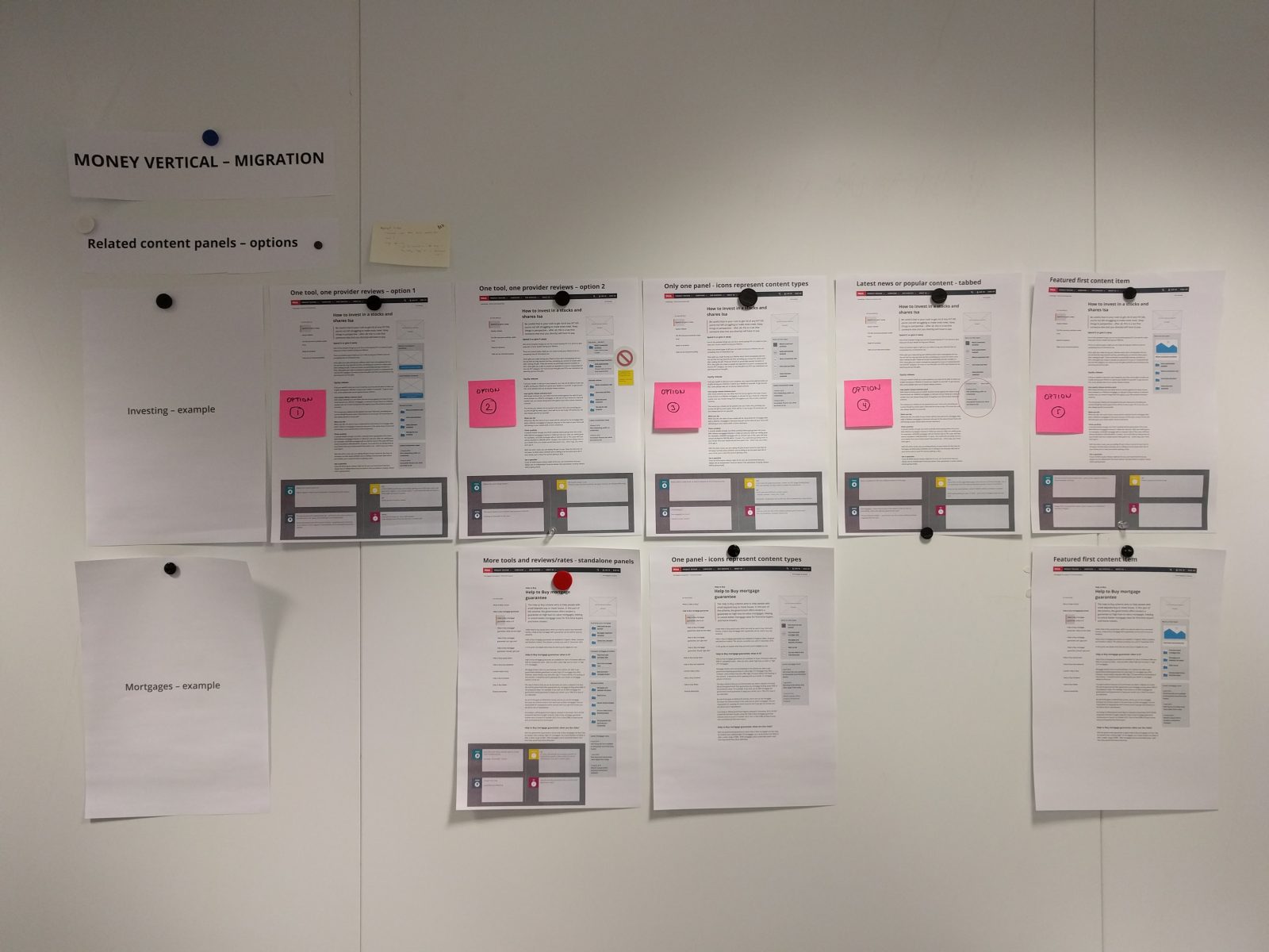
New sub-vertical and vertical templates
The category pages (sub-verticals) were one of the main pain points for the users – based on our research insights. I proposed and designed a new template. As we strived for a cohesive experience, the project brief was expanded, so that the template did not cater for the Money section only but for the whole of which.co.uk.
To accommodate a number of different types of content that which.co.uk offers, I suggested a modular card based layout, that would be flexible enough to satisfy different stakeholder needs.

Usability testing
The new category pages were tested in a lab session that I helped to prepare, conduct and analyse with a fellow user researcher.

Stakeholder management
This phase also involved a lot of stakeholder management – I set up (or was invited to present at) several all-hands sessions with the Money team. These sessions were key to gathering feedback on new designs as well as to keeping the team engaged and promoting a common goal.

Delivering
Walk-throughs and Q&A sessions
Developers and a UI designer were involved in the design process to create an overall understanding of the project, to share a common goal and to check the feasibility of proposed solutions.
UX & UI design review sessions
Designs were also scrutinised at weekly UX & UI design review sessions.
Outcomes
The redesigned experience propelled Which? Money to where it should have been – among the leaders in consumer financial advisory.
Users responded positively to the new design during qualitative testing sessions, and Treejack tests showed a significant decrease in task completion times, along with a significant increase in direct path success. This demonstrated that navigating the site and finding desired content became much faster.
Transformative for Which? was also the participative design approach. Engagement levels and acceptance of user-centred design thinking among stakeholders increased throughout the project, further aiding the Design team’s push towards an organisational mindset shift.

”Matej has been instrumental in the re-design of the Which? Money proposition and again his grasp of complex content, intricate IA and limitations of the content systems and underlying technical structure was crucial to the successful completion of the initial migration – which has in turn built a solid foundation for the subsequent iterations and the development of new propositions in the financial space.
Rick LippiettHead of Design & UX, Which? (as of 2016), LinkedIn recommendation (2016)


